
Although I use Artificial Intelligence extensively to acquire and check information, I continue to be appalled by AI mapping. Every day, my X (Twitter) feed is filled with AI-generated maps that are laughably inaccurate and hideously malformed. I am perplexed by this phenomenon. How can a technology that is so powerful that it can solve mathematical quandaries that have long eluded some of the world’s sharpest minds fail to generate simple political maps with recognizable shapes and accurate positions of countries, states, and other polities?
For evidence of this claim, I will simply reproduce a few of the recent maps posted by the especially egregious X-account called “World of StatHistics.” With 72,500 followers, this account promises to “turn raw data into real stories.” I won’t take the time to analyze these maps in detail, as I trust that my readers will be able to see what I mean. But a few words are in order regarding each map.
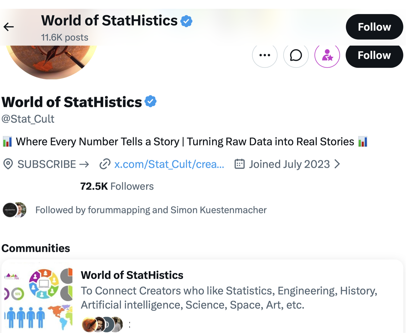
The map of the Mongol Empire (below) is bad enough at outlining the empire itself, but its depiction of the eastern Mediterranean and Black Sea region is comical. Note on the inset map how the Black Sea has essentially been doubled, depicted twice.
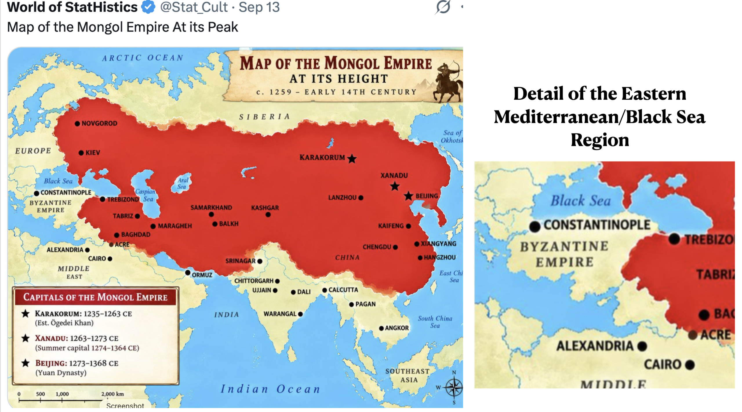
The next figure supposedly maps the handsomeness of men in the U.S. by state. The very idea that such a subjective matter could be accurately mapped is problematic enough, if not offensive. Many readers will no doubt view its portraits as racist; even the “handsome Hawaiian” appears to be a white man, albeit one wearing a lot of eyeliner (and who oddly appears to be blind in one eye). But more to the point, the sizes and shapes of many states are wrong, and the mapping of much of the east coast is n a travesty.
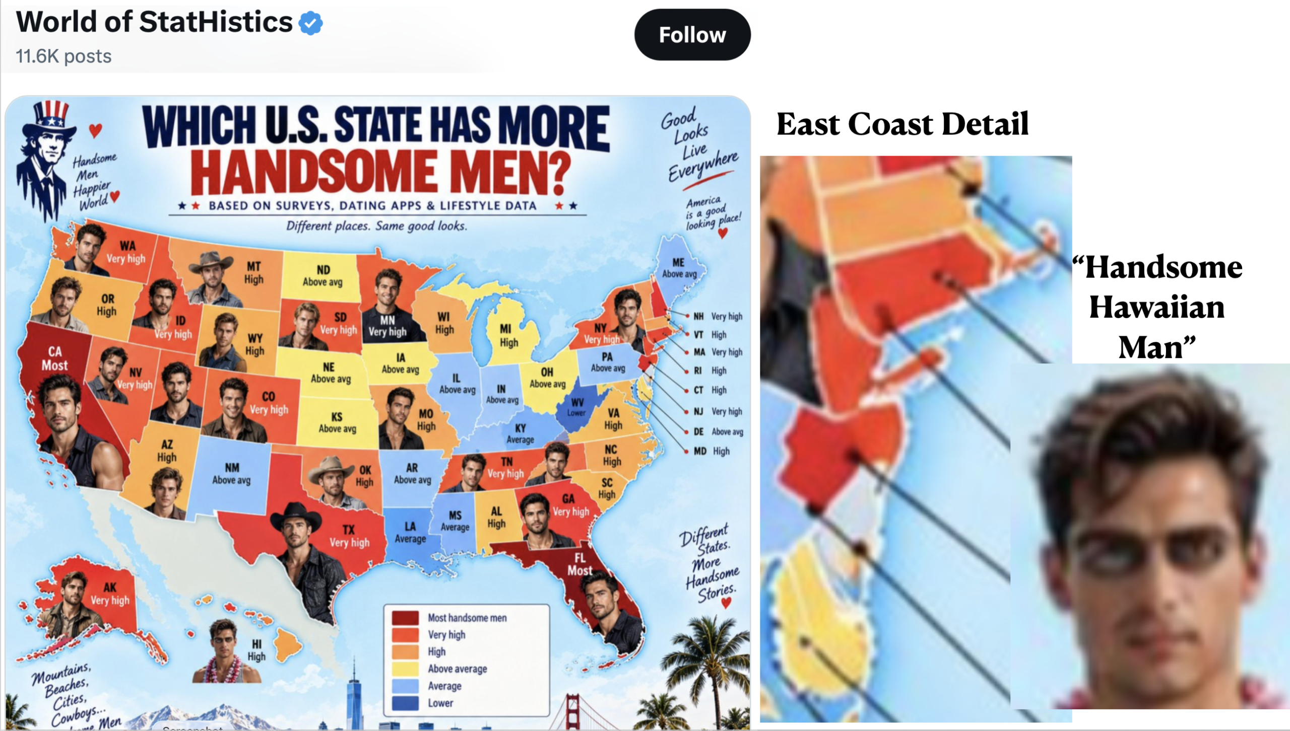
A “World of StatHistics” map of perceptions in Japan of the nuclear bombing of Hiroshima and Nagasaki is, if anything, even worse. Note that Honshu and Kyushu have been joined together to form a single island. The data source is a mystery, and most of the information presented is difficult to believe. The bar graph labeled “national overview” and the mapped patterns do not, moreover, agree. The graph indicates that just under half of the people of Japan “strongly condemn” the attacks, but the country’s population centers are all mapped as neutral or indifferent. Only the people of Hiroshima and Nagasaki are shown as feeling deep grief. Okinawa, where hostility to U.S. military bases runs deep, is depicted as having sympathy for the bombings, although it is colored as “rarely thinking about it.”
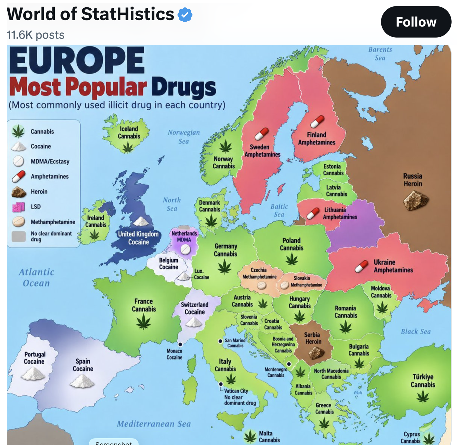
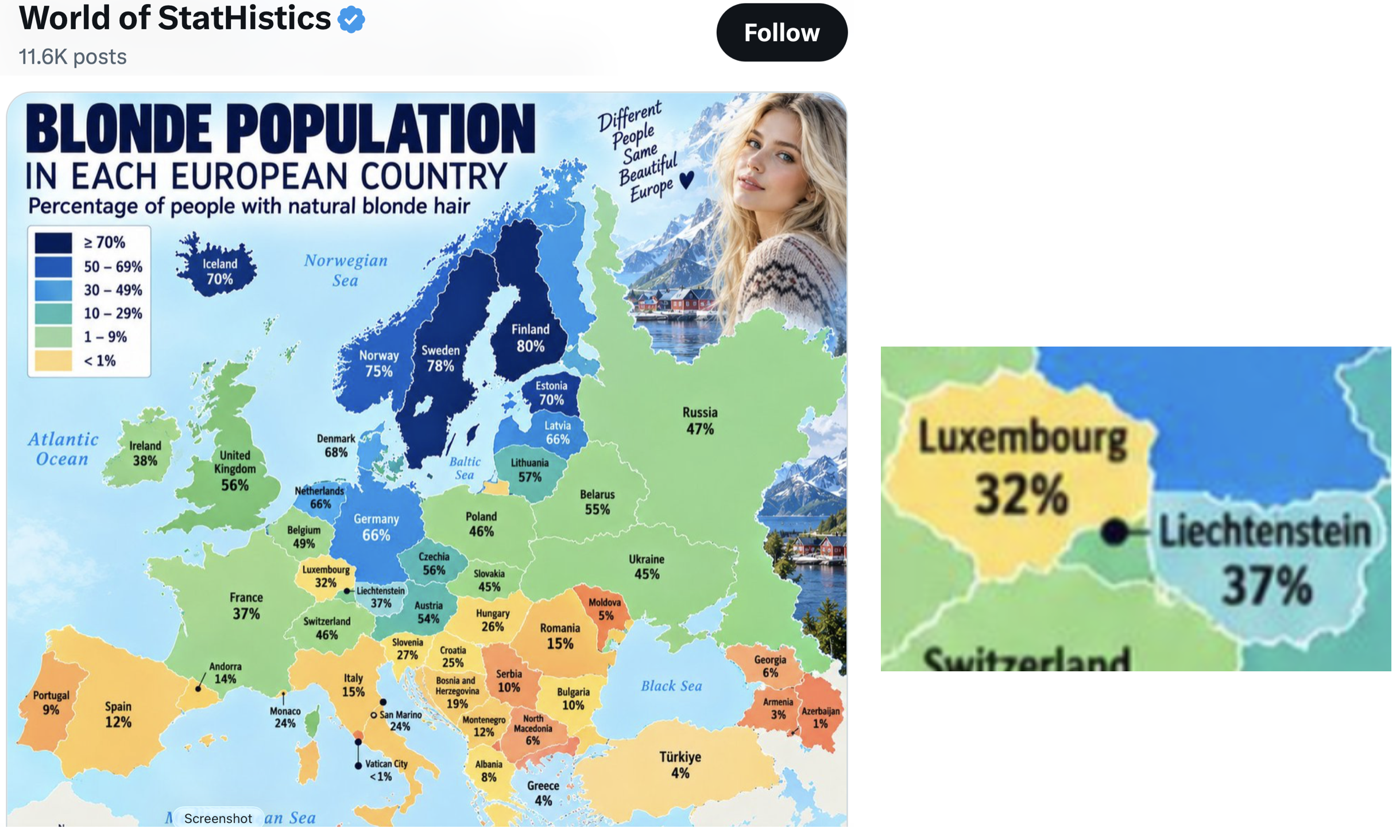
I conclude with two “World of StatHistics” maps of Europe. In both cases, the size and shapes of many countries are wildly distorted, but in different ways. For the first map, pay particular attention to Denmark, Switzerland, Greece, and Northern Macedonia. (I find it amusing that the author felt compared to opine that there is “no clear dominant drug” in Vatican City.) On the final map, the depiction of Europe’s smallest countries is particularly bizarre. Monaco and Vatican City are shown as having substantial territories, Luxembourg and Lichtenstein are greatly enlarged (although it is unclear which colored area is supposed to be Lichtenstein), and Catalonia is confused with Andorra. Note the portrayals of Georgia and Armenia as well as those of Greece and Albania.
I must wonder whether any human reviewed these maps before they were posted. If so, the person is geographically incompetent and is in no position to have such responsibility. If, on the other hand, this was all done by a machine, the result is even more disturbing: the automated production of geographical misinformation.